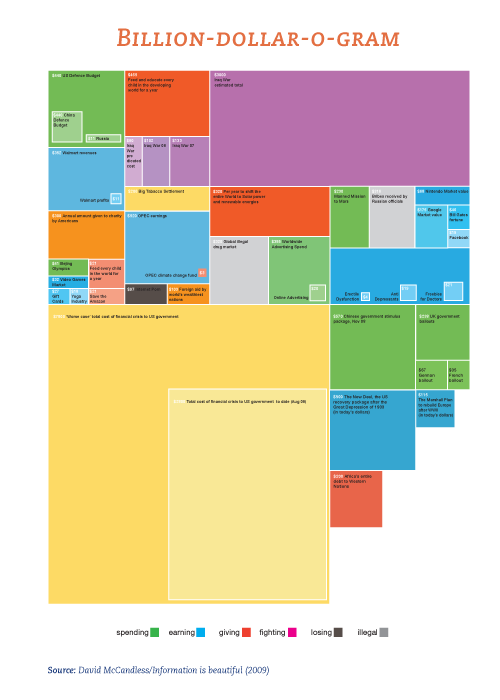
Human are visual beasts, from our earliest stages we use our eyes to learn, explore and compute. The fastest path to the brain is our visual system, consider the enormous amount of information delivered on a daily basis. No tool has capitalised on this visual ability more than the computer. Modern devices rely on touch sensitive screen all using Graphical User Interfaces (GUI).
When Xerox first created a Graphic User Interface little did they realise the impact that it would have on society. Today we look around and graphic user interface abound, but what does an GUI actually do? It visualises the processes of software applications (APPS) run by the operating system (OS) and turns them into pixel then icons and symbols that we can readily recognise on the screen.
A look at the development of computer graphic visualisation milestones, and we can see the impact that computer graphics has had on modern society, GUI’s surrounds us. Our reliance on Graphic User Interfaces will only increase as augmented information systems (where a layer of information is placed between us and what we see) and the likes become more common. The language used by these interface is in turn called ‘Infographics‘, icons, colour and symbols that give instant meaning globally. Meaning not through rigid alphabets but universal images.
Infographics is not something new, cave drawings were the first use of symbols to communicate, so why has this use of images to communicate becoming more important. A digital society will become dependent on infographics to understand the ‘Big Data’ phenomenon (we will get back to this). All the these devices we see around us today are generating quite a bit of data, and to overcome this challenge we will need some system to handle the volume.

Sight is our first and primary sensory source for information, the quickest access route for information to our brains. It allows us to identify patterns at every level. A glance can enable the person involved to maximise their information intake, and it commences long before we are actually conscious of it.
In his book ‘The User Illusion’,a Danish scientist, Tor Nørretranders, visually illustrates the ‘bandwidth of the senses.‘ He compares the throughput of each of our senses and represents them visually, then uses a computing analogy, compares it with certain devices you will see this illustration and just how important sight is as the premier information channel. By using an element of vision called ‘pre-attentive processing’ to focus at a core level. This assesses attributes of the element without the need for specific focus, all at an unconscious level.
With the proliferation of smart phones and other mobile devices, we enter a new zeitgeist. Not unlike the Rubicon that the media industry experienced in the 1990’s, when many analogue processes were replaced with digital ones. By visualising content and tapping into ‘pre-attentive processing’, this will increase the volume of information that we take onboard.
An intuitive design can make information easy to grasp and render it useful to the viewer, naturally the quicker the better. As the information being displayed is dynamic and therefore keep the audience’s attention, this is key! The viewer will not only be entertained but educated, and we all know the value of an educated customer.
Makinmediamobile can animated motion to any infographics in the form of Explainer videos, giving your message a more dynamic feel that will attract audiences. Your Explainer video will educate any potential customer and preempt any recurring question they have, allowing them seize the initiative and creating inbound leads, which…are the best type of leads.
Our Explainer video will illustrate your process, reinforce your brand or simple convey your message that will help you communicate with your customers. If you are using the internet to reach these people, let us help you maximise the benefit of the internet for your business, you be surprised how cost effective this can be. Drop us a line and we will will help get your message across.


