VR for corporate uses versus games
It’s clear that Virtual Reality brings with it a number of challenges when it comes to the experience of the user – is it comfortable to use, useful, entertaining? There are also very specific issues around the production of what I am going to call “Corporate VR” here – that is the kind of VR experiences which we make here at Mersus Technologies; those for branding and marketing, training, education etc., as opposed to the production of games where the goal is purely entertainment. User Experience Design can help us address these challenges.
As with any new frontier, we face an additional challenge that games manufacturers do not have. That is, that a large number of the intended users of our products have little or no experience of gaming. This brings huge differences in terms of the user’s expectations when considering both the look and capabilities of the VR experience. It also makes it vital for us as designers to assume that the user has little or no familiarity with gaming when we are designing user interfaces and assigning the control schemes. If the user experiences any frustration when interacting with the VR experience, they are likely to walk away.
Virtual Reality can cause motion sickness in many users if the VR is badly optimised or planned. It goes without saying that we as designers need to avoid exposing any of our users to a nauseating experience, but I think this is doubly important for users inexperienced in VR. With the technology still quite new, we are ambassadors for it. We don’t want the first experience of a user, who may be reluctant to even put a headset on, to be one of VR sickness! The purposes of corporate VR differ from those of gaming in several ways, although making a comfortable, user friendly and visually appealing experience is a must. We need to convey all of the information in a highly detailed way, which is certainly the case when it comes to VR training.
Take for instance the challenge in creating VR objects appear to be the ‘actual’ size of their real world counterparts, while keeping them easy to interact with – a challenge often side-stepped in gaming by the use of scaled up or ‘cartoony’, stylised objects. With VR training, a balance needs to be struck between making an object look and feel close enough to its real world counterpart, in order for the outcome to be successful, and without making it too small and “fiddly”. It is essential that the user finds the VR experience intuitive and useful. If they feel foolish, they begin to doubt the relevance and likelihood of gaining anything useful from the experience and thus, are unlikely to use the product again. They may even begin to worry about how they look to others, which breaks the immersive aspect of using VR. This key thing – the preservation of the feeling of immersion – is probably the most crucial aspect of incorporating UX thinking into the design of VR experiences.
It’s clear that Virtual Reality brings with it a number of challenges when it comes to the experience of the user – is it comfortable to use, useful, entertaining? There are also very specific issues around the production of what I am going to call “Corporate VR” here – that is the kind of VR experiences which we make here at Mersus Technologies; those for branding and marketing, training, education etc., as opposed to the production of games where the goal is purely entertainment.
As with any new frontier, we face an additional challenge that games manufacturers do not have. That is, that a large number of the intended users of our products have little or no experience of gaming. This brings huge differences in terms of the user’s expectations when considering both the look and capabilities of the VR experience. It also makes it vital for us as designers to assume that the user has little or no familiarity with gaming when we are designing user interfaces and assigning the control schemes. If the user experiences any frustration when interacting with the VR experience, they are likely to walk away.
Virtual Reality can cause motion sickness in many users if the VR is badly optimised or planned. It goes without saying that we as designers need to avoid exposing any of our users to a nauseating experience, but I think this this doubly important for users inexperienced in VR. With the technology still quite new, we are ambassadors for it. We don’t want the first experience of a user, who may be reluctant to even put a headset on, to be one of VR sickness! The purposes of corporate VR differ from those of gaming in several ways, although making a comfortable, user friendly and visually appealing experience is a must. We need to convey all of the information in a highly detailed way, which is certainly the case when it comes to VR training.
Take for instance the challenge in creating VR objects appear to be the ‘actual’ size of their real world counterparts, while keeping them easy to interact with – a challenge often side-stepped in gaming by the use of scaled up or ‘cartoony’, stylised objects. With VR training, a balance needs to be struck between making an object look and feel close enough to its real world counterpart, in order for the outcome to be successful, and without making it too small and “fiddly”. It is essential that the user finds the VR experience intuitive and useful. If they feel foolish, they begin to doubt the relevance and likelihood of gaining anything useful from the experience and thus, are unlikely to use the product again. They may even begin to worry about how they look to others, which breaks the immersive aspect of using VR. This key thing – the preservation of the feeling of immersion – is probably the most crucial aspect of incorporating UX thinking into the design of VR experiences.
User Experience Design
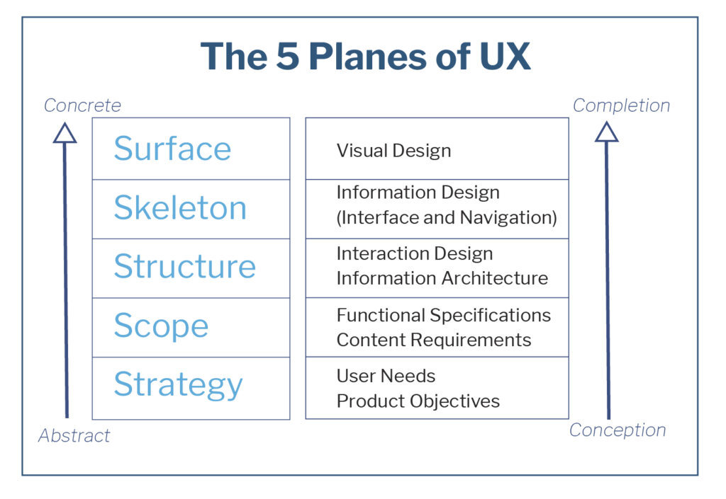
So, how does User Experience Design help us here? UXD as a discipline has been developed largely for making apps, and especially websites, more user friendly and ultimately more successful. How it does this is through meticulously planning and designing each aspect of the product. There are five ‘planes’ associated with User Experience:
- Strategy
- Scope
- Structure
- Skeleton
- Surface
All of this is absolutely applicable to corporate VR experiences and VR in general, and is very helpful in ensuring that any VR product does exactly what is intended. When we apply UXD ideas to our design, no aspect of the user’s experience can be left to chance, and the user should have an experience that they find enjoyable, intuitive, empowering and above all, one which holds value for them.
The 5 Planes
In brief, at the very start of a project we address Strategy. That is what the VR experience is meant to achieve. Next up is the Scope – that is its features and functions. The Structure is the way in which the scope will be met and reached, and through what means that will be achieved. The Skeleton is how these elements are organised and arranged, and the Surface is all the visual and aural elements of the experience – everything you can see, hear and interact with.
It may seem obvious, but we really need to know what it is that we are building, or else the product is going to be confused (and confusing!), unfocused and ultimately will fail. This is why both Strategy and Scope are so essential. If I (I’m a concept artist mostly) think we are designing an analytical tool, and my colleague beside me (a developer) thinks we are building a corporate marketing experience, then we are both approaching the design in very different ways. The client and the designers not being on the same page leads to time wasted designing the wrong things and then fixing things that make no sense to the overall project. And assumptions may even cause confusion among members of the design team. You can probably guess that the scenario I mentioned above is not entirely hypothetical! When Strategy and Scope are worked out correctly in the early stages of the project, accompanied by our client-engaged agile workflow, wasted efforts are avoided. This ensures the finished product will be more cohesive and successful, and that our resources are used in an efficient way.
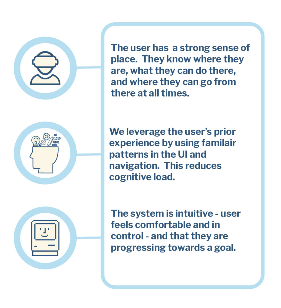
There are two elements to the Structure plane; Interaction Design and Information Architecture. Interaction design is about how the user interfaces (UIs) work, their patterns and sequences. It ensures that all the options are presented to the users in an appropriate and consistent way. Using predictable patterns leverages the user’s previous experience of other user interfaces, making the experience more intuitive for them and reducing cognitive load. As previously mentioned, many of the users we are designing for have little or no gaming experience. But they will be familiar with smartphones, how to record a TV show and with other systems that contain UIs. There is no point in reinventing the wheel when it comes to user interfaces. In fact, you would want a very compelling reason for laying anything out differently from the well established patterns that already exist.
Every interaction the user makes with the product must produce feedback that is clear, immediate and consistent. We want the user to feel like they are in control, and that they are progressing towards a definitive goal.
Information architecture describes how we organise, arrange and prioritise the content. As VR products become ever more complex, then the Information Architecture involved becomes more and more important, ensuring that all the information is presented in the correct order, and in a way that is easy for the user to digest.
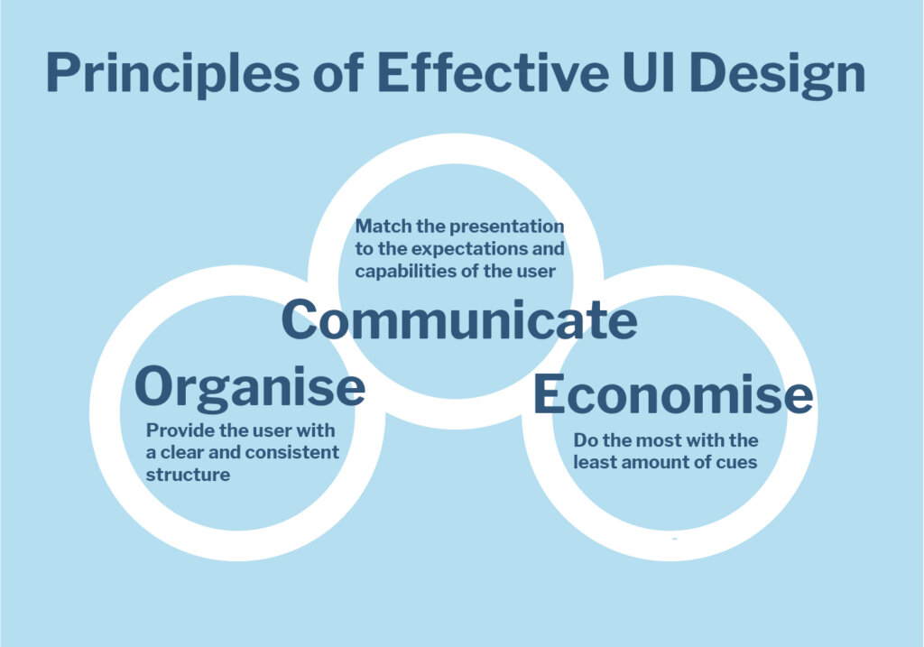
At the Skeleton plane we lay out the Interface Design and Navigation Design, in order to ensure that the user can get where they need to go and find the information required. At this stage, we keep in mind that everything involved here should serve to organise, economise and communicate the intended purpose of the VR experience. It is an important aspect of UX thinking to eliminate all unnecessary information. So if there is a piece of UI that the user doesn’t need at a particular point in the experience, then it should be removed or at least de-emphasised for that time. Present to the user the information that they want, when they want it. It is at this stage where we apply our storytelling and sequencing skills, in order to unfold the experience at the correct pace and create the desired atmosphere.

Finally we come to the Surface Plane, which is everything that the users directly perceive in the VR experience. These are the various layouts, typography, colour, imagery, music and sound effects, the sequencing (visual storytelling) and the visual identity (branding). This is where we get into the fun stuff like the psychology of colour (which is culturally subjective, meaning that it needs to be accounted for while mapping out who our users are), and heat mapping too – which determines how the users’ eye movement responds in predictable patterns as they seek information. Websites are very often designed to place the important information along an F or Z pattern, which are two of the most common ways that users scan a page. Similar thought is required into how each element is placed within the VR scenes. This is determined by whether the user needs to find the particular element quickly, or if the preference is to allow them the luxury of exploring the scene at their own pace.
There is also a whole area of UXD which addresses measuring the success of particular products. In the case of VR it may be quite easy to measure the results, such as reduced training costs, or better retention of information by trainees. Or it may be something more difficult to quantify, such as how effective a branding/marketing exercise has been. It is important to measure where a product has succeeded and where it has performed less well, as this will hone our UXD skills as time goes on.
-

Some Aspects of a Product Delivering Good UX
Conclusion
We have only really scratched the surface of UXD here, but I hope that this shines a light on the potential usefulness that it brings to the design process involved in producing Corporate VR. There is a lot of complexity involved in designing and building a VR experience that conveys what is intended, and is also fun and easy to use. UXD gives us a tool to deal with this complexity. There is a lot going on under the surface in order to present a clear and intuitive experience to our users. But UXD ensures all these unseen layers of design are working towards delivering the experience we and our client want to create.
The fact of the matter is that if a VR product doesn’t deliver a good User Experience, it doesn’t work. If the user feels lost, confused, or that they are wasting their time, the immersion is broken. For that reason, UXD is even more crucial to designers of immersive media than to the web and app developers who invented it. Fortunately, User Experience Design is a well researched and developed field, and when one takes the time to add it in to the design and development process the outcome is fun, intuitive and informative for the user. Moreover the product will do exactly what the client who commissioned the VR experience wants it to do. The client is happy to have a product that fulfils its objectives, the user is happy to have a fun, intuitive and useful product, and we are happy that we have fulfilled our design brief. That is the power of good User Experience Design.
Fiona Moran is a Concept Artist at Mersus Technologies, and is currently studying Augmented and Virtual Reality and User Experience Design. You can find out more about UXD at UX Magazine, UX Booth, and Give Good UX.

